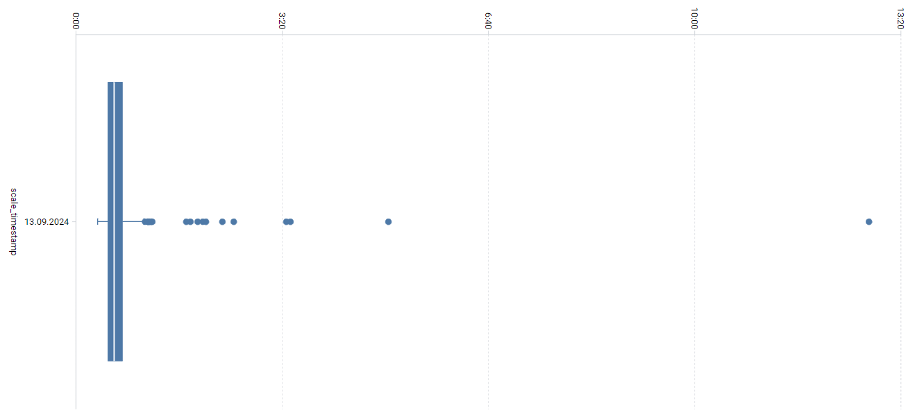
Really happy to see the boxplot chart being available in the analytics section. But right now it is quite difficult to tell what the values are that have been determined. There are no tooltips when you hover over the plot’s components like on the other charts - or am I missing something?
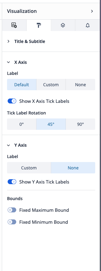
Also, I was looking for a way to adjust the orientation and the resolution of the axis ticks.
Very reasonable requests here, thanks for bringing these up!
In terms of axis readability / adjustability, that was improved with r267 (Factory 267 Release - November 2023). I believe you are on LTS releases, so you can expect that in LTS12.
In terms of tooltip labeling, I will defer to @stefan if he has any insights there
Gotcha, okay so I believe you should be able to adjust you axis orientation via the right hand visualization pane (per r267). Resolution looks like it is not adjustable though.
This is still in backlog for the Analytics team and does not have a planned implementation date. Boxplots are one of the least utilized charts in the platform, so the team has had to prioritize other work ahead of this.
Would you be able to accomplish what you want to visualize with another type of chart?
Thank you for the update Beth. Too bad… But then again it is no real surprise to me, because in its current form it cannot be used for anything meaningful as the metrics are not accessible - and that’s the value of that chart type in the first place.
That is a very fair point, maybe it it is not a commonly used chart because of the feature limitations.
I will make sure the team is aware of your perspective and thoughts here! Likely will stay on backlog for a bit, but we won’t close the ticket. If others in the community are interested in this and vote / comment, it can help this get prioritized more quickly in the future