Hello!
It would be a great addition to have the option to add placeholder text to all input fields across the platform.
This feature would be especially useful for guiding users on what to enter without relying on labels. It can also help reduce visual clutter (for minimalist UI designs) and improve the user experience in actions like searching, filtering, or making quick inputs.
Example:
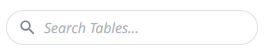
When using a text input as a search bar, a placeholder like “Search all apps” or “Type to filter” gives users immediate context. This is already implemented effectively in the Table section for search (screenshot attached below).
Thank you!
Milos
Yes, and It would also be very useful if all input widgets have an “enable state”
Hi @milos.markovic great suggestion.
To clarify, are you asking for the inputs in the core App Editing experience to have better guidance, or a way to allow App Builders to create inputs with built-in placeholder text?
Hello @OlgaStroilova ,
Thanks for the response. Let me clarify my point a bit better.
What I meant is that during App Editing, when an App Builder adds, for example, a Text Input Widget, besides being able to configure options like datasource, label font and size, widget size, etc., there should be a new option called Placeholder Text.
The Placeholder Text option could be located, for example, under the Label Styling section, and would have a text input field similar to the Label field. The App Builder can enter any text here, which will be displayed inside the input field itself.
Then, when using the App Player, the user would see the Text Input Widget with the Label and the empty input field showing the placeholder text. As soon as the user types something, the placeholder text disappears.
Example:
Inputs – Number
Label: Working Hours
Placeholder Text: Enter a number of working hours.
In the end, it would look something like this:

Thank you for the additional detail, and for posting the suggestion here!
We keep an eye on upvotes to help with prioritization.